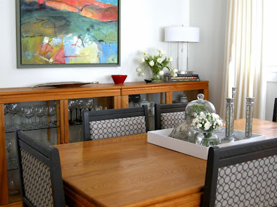
You know how it goes with decorating. You get one thing to a point where you love it and that improvement only makes other things in the space look dismal. And that is the point where we left off in the last post- loving the chairs and not liking what is happening on top of the buffet.
 |
| Almost but not quite |
One problem area
Let's start with the lamp. I've always loved this lamp and when I recently moved it from the living room it needed a new home. I perched it on several books as a way to increase the height and connect the dark chair colour to the buffet.
I left it for several days, but I knew what would happen. Every time I passed by I had the same thought
( that shade is way too white). Problem arising... what were the chances I would find this type of lamp shade in St. John's? NIL What was left? Paint it or cover it with fabric or paper. I chose paint knowing if I totally messed it up I could use fabric or paper to cover it.
What colour?
The lamp had to relate to the drapes without overmatching, I trotted to my studio to see what I had there and chose BM floral white OC29 left over from painting frames for an dart show.
 |
| Benjamin Moore Floral White OC 29 |
This is a dirty white with the faintest hint of warmth without looking too yellow. Perfect in my book. Some bloggers recommend it as a good white for cabinets if you have white appliances.
How to?
I watered down the paint by half and brushed it on with a 2 inch art brush -synthetic soft hair for acrylic paint. It's a messy business so have something to catch the drips. If you are careful you only need one coat. It worked like a charm with no buckling or patchy areas. You definitely have to water down the paint or it will look too solid and not be absorbed into the fabric.
Some references I consulted said to use a fabric medium with the paint but I didn't. From my art experience I think you could add acrylic matte medium to replace the fabric medium if you so desired.
Problem two
Once I used red as an accent on the buffet and in my living room, my beautiful landscape by Carolyne Honey Harrison started to remind me of a Christmas tree. The green frame (which hubby made for it) had to be changed. I have a terrible aversion to "seasonal" colour connections.
What colour?
First I painted the frame BM Black panther, a soft black I use for art frames, but it was too harsh for this particular artwork and space. All you could see was the frame. I prefer the art to show and the frame to support it.
 |
| Benjamin Moore Black Panther 2125-10 |
 |
| Benjamin Moore Iron Mountain 2134-30 |
Next try was BM Iron Mountain left over from painting my Media unit (
see here). Worked like a charm. It brought more dark to that side of the room and played off the chair colour without matching perfectly. My daughter joked that everything in my house would soon be some form of charcoal. Possibly!
The reveal
 |
| Almost but not quite |
 |
| Subtle changes make a difference |
And you might think this room is now complete. I wish! More problems and solutions to come.
Is paint a solution in your home decor? I'd love to hear what you've done with it.
Related Posts


